Due to an unforseen delay at Creative Printing that won't allow them to print my brochure for me until tomorrow morning, I have one last chance to modify my brochure before they print it.
Here's what I came up with after integrating Marilyn and Ed's advice on how to improve it.
Under Ed's suggestion to mess with the text-boxes by interrupting them with other objects and images, I played around with the shield a bit on the interior, so here's a shot of another possible interior layout:
If Marilyn or Ed is reading this, please, send me some feedback! I can change the file I'm printing up until 8:30 AM Thursday morning, so there's still time for last-minute changes.
Logan Agle - Graphic Design 5
Wednesday, May 2, 2012
Brochure Final Designs
Here are potentially my final designs for the brochure.
Exterior:
Interior:
Hopefully I've met with at least SOME form of success here.
Exterior:
Interior:
Hopefully I've met with at least SOME form of success here.
Monday, April 30, 2012
Finalized Poster Designs Part 3
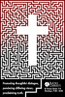
Here are some even more finalized versions of my poster, which I feel may be nearing completion after meeting with Marilyn about them.
All three of these are based around further manipulation of the text at the bottom. They are really minor tweaks, as we're getting into refining the finest details of this poster at this point. I think the third one may be ready to print.
All three of these are based around further manipulation of the text at the bottom. They are really minor tweaks, as we're getting into refining the finest details of this poster at this point. I think the third one may be ready to print.
Finalized Poster Designs Part 2
Here I started experimenting with a new graphic-element: a leader-path at the bottom of the poster that leads into the maze.
It can work as a text-element as well to divide the two major pieces of text I have to incorporate.
Here I tried making the path zig-zag (it's meant to be a continuation of the maze's pathways).
Here I gave a little more space to the text by modifying the shape of the leader-path.
And here I've modified the the text again and adjusted the leader-path accordingly.
Finalized Poster Designs Part 1
Here is the base-model for the current version of my poster, lacking the gradient or anything.
Here is a version with the burgundy-to-black gradient on the maze.
Here is a possibility for altering the color-gradient, as it's diagonal in relation to the poster rather than horizontal.
Here is a version where I think I may have modified the text at the bottom for the better.
And here's a version of that with further alterations, modifying the text's leading and kerning.
Sunday, April 29, 2012
Logo Final Analysis
Here's a version of my logo altered based on Barbara Yale-Read's suggestions.
And here's a version of my logo altered based on the feedback I got from the AIGA Critique Page on Facebook.
And here's a version of my logo altered based on the feedback I got from the AIGA Critique Page on Facebook.
Tuesday, April 24, 2012
Some Logos after talking to Marilyn today
Here is the logo with increased space between the logo and text compared to previous versions.
Here is an attempt at reducing the size of the letters after the first.
Subscribe to:
Posts (Atom)


